Extract: Inequality and the Gini Coefficient
9th October 2015
source The Economist
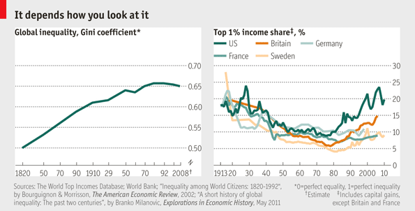
Including capital gains, the share of national income going to the richest 1% of Americans has doubled since 1980, from 10% to 20%, roughly where it was a century ago. Even more striking, the share going to the top 0.01%—some 16,000 families with an average income of $24m—has quadrupled, from just over 1% to almost 5%. That is a bigger slice of the national pie than the top 0.01% received 100 years ago.
This is an extraordinary development, and it is not confined to America. Many countries, including Britain, Canada, China, India and even egalitarian Sweden, have seen a rise in the share of national income taken by the top 1%. The numbers of the ultra-wealthy have soared around the globe. According to Forbes magazine’s rich list, America has some 421 billionaires, Russia 96, China 95 and India 48. The world’s richest man is a Mexican (Carlos Slim, worth some $69 billion). The world’s largest new house belongs to an Indian. Mukesh Ambani’s 27-storey skyscraper in Mumbai occupies 400,000 square feet, making it 1,300 times bigger than the average shack in the slums that surround it.
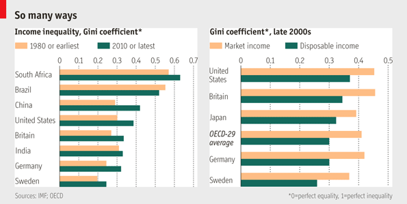
The concentration of wealth at the very top is part of a much broader rise in disparities all along the income distribution. The best-known way of measuring inequality is the Gini coefficient, named after an Italian statistician called Corrado Gini. It aggregates the gaps between people’s incomes into a single measure. If everyone in a group has the same income, the Gini coefficient is 0; if all income goes to one person, it is 1.
The level of inequality differs widely around the world. Emerging economies are more unequal than rich ones. Scandinavian countries have the smallest income disparities, with a Gini coefficient for disposable income of around 0.25. At the other end of the spectrum the world’s most unequal, such as South Africa, register Ginis of around 0.6. (Because of the way the scale is constructed, a modest-sounding difference in the Gini ratio implies a big difference in inequality.)

Income gaps have also changed to varying degrees. America’s Gini for disposable income is up by almost 30% since 1980, to 0.39. Sweden’s is up by a quarter, to 0.24. China’s has risen by around 50% to 0.42 (and by some measures to 0.48). The biggest exception to the general upward trend is Latin America, long the world’s most unequal continent, where Gini coefficients have fallen sharply over the past ten years. But the majority of the people on the planet live in countries where income disparities are bigger than they were a generation ago.
That does not mean the world as a whole has become more unequal. Global inequality—the income gaps between all people on the planet—has begun to fall as poorer countries catch up with richer ones. Two French economists, François Bourguignon and Christian Morrisson, have calculated a “global Gini” that measures the scale of income disparities among everyone in the world. Their index shows that global inequality rose in the 19th and 20th centuries because richer economies, on average, grew faster than poorer ones. Recently that pattern has reversed and global inequality has started to fall even as inequality within many countries has risen. By that measure, the planet as a whole is becoming a fairer place. But in a world of nation states it is inequality within countries that has political salience, and this special report will focus on that.

From U to N
The widening of income gaps is a reversal of the pattern in much of the 20th century, when inequality narrowed in many countries. That narrowing seemed so inevitable that Simon Kuznets, a Belarusian-born Harvard economist, in 1955 famously described the relationship between inequality and prosperity as an upside-down U. According to the “Kuznets curve”, inequality rises in the early stages of industrialisation as people leave the land, become more productive and earn more in factories. Once industrialisation is complete and better-educated citizens demand redistribution from their government, it declines again.
Until 1980 this prediction appeared to have been vindicated. But the past 30 years have put paid to the Kuznets curve, at least in advanced economies. These days the inverted U has turned into something closer to an italicised N, with the final stroke pointing menacingly upwards.

0 Comments