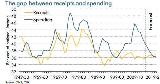
Graph: Receipts and Spending as % GDP
21st September 2015
It is not spending and tax receipts in absolute terms that should concern us, but these totals as a proportion of national income (below). This gives us a test of affordability – if spending increases as a % of GDP (national income), it means we are less likely to be able to afford that level of spending. It is consuming too much of our national wealth. It also means tax receipts must rise to cover his level of spending: but higher taxes have supply-side effects on the British economy (they are a cost to firms and distort the work/leisure trade-off, or the work/welfare benefit trade-off). This becomes another application of that eternal economic truth: opportunity cost is the true measure of economic cost. Below we can see that in the recession that followed the financial crisis of 2007-8, spending rose to 46% of national income as receipts fell to 36%. The gap between them widened to 10% of GDP.


0 Comments