Handout: An Introduction to Aggregate Supply
15th September 2015
Aggregate Supply
Aggregate Supply (AS) shows the short run relationship between the price level and the quantity of goods and services that firms are willing to offer for sale. The aggregate supply curve therefore plots the level of real domestic output, Q, (or income, Y) against
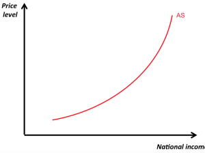 the price level (which we take as equivalent to the rate of domestic inflation in the macroeconomy).
The aggregate supply curve is upward sloping because firms are willing to produce more output at higher price levels. In the short run, producers respond to higher demand (and prices) by bringing more inputs into the production process and increasing the utilisation of their existing inputs. In the long run, however, changes in the price level do not affect the level of real GDP.
Thus the long run aggregate supply curve (LRAS) is vertical.
Shifts in SRAS
Shifts in the SRAS curve are caused by unexpected changes in the prices of producer inputs (Land, Labour, Capital – rent, wages and interest)
-
Wages
If real wage levels fell, for example, we would show the whole AS curve shifting to the right. Firms would be willing to produce more output, because their costs have fallen relative to price levels. If real wages rise, AS shifts to the right.
2. Raw material and energy prices
Higher fuel prices, or higher taxation levels, would cause a leftward shift of the whole SRAS curve.
3. Taxation
If company tax rates rise, this will cause an inwards shift in aggregate supply.
4. Interest Rates
Interest rates represent the price of credit and are a cost to the company. Higher interest rates will cause a leftward shift in AS.
LRAS
Long run aggregate supply (LRAS) is driven by improvements in productivity and by an expansion of available factor inputs (more firms, a bigger capital stock, an expanding active labour force , net migration), and the productivity of those inputs. (improved skill levels in the workforce, for example). Notice that in the short run, any increase in aggregate demand will be inflationary – firms cannot increase output in line with demand (see below).
Over time, we would expect an outward shift in the long run supply curve, as the quantity and productivity of productive 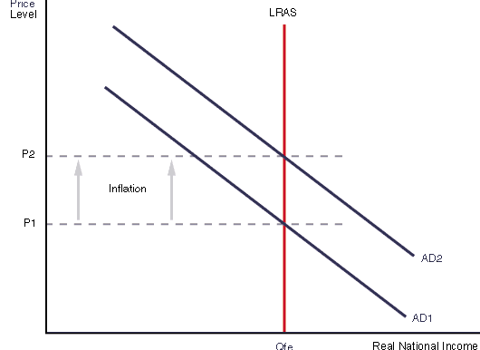 factors increases. (e.g. an increase in labour, productivity and improved technology).
This corresponds to an outward shift in the country’s production possibility frontier (PPF).
Eternal Economic Truth: almost all that matters in the long run for the economic wealth and health of an economy is productivity growth. Productivity growth raises the productive capacity of an economy and makes rises in real wages affordable.
Long run and short run equilibrium
The intersection of the three curves describes long run macroeconomic equilibrium for the economy. Qp indicates the 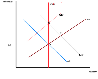 potential output of the economy, given current levels of resources and technology. The price level (Pc) means there is no upward pressure on prices (P constant). At this point, everyone who wants a job can find one, and the economy is operating at normal capacity.
If aggregate expenditure rises at this level of output, the economy will move from point E to F. There is excess aggregate demand and prices begin to rise. The classical model predicts that the economy will never persist at levels of output higher than Qp – any demand increase above that level is inflationary.
Conversely, if expenditure is below the equilibrium level, then lower output is translated to less demand for the factors Qp
of production such as labour and capital equipment, levels of investment in new equipment fall, and unemployment rises.
The intersection of the AD, SRAS and LRAS curves therefore describes long run macroeconomic equilibrium. The level of output (Qp) is at the economy’s potential, given current levels of resources and technology. The price level (Pc) means there is no upward pressure on prices. The model shows an economy operating at its normal capacity. This economy will be on its Production Possibility Frontier (PPF).
Explaining the Trade Cycle (business cycle) using AD and AS
An economic downturn, such as the recession of 2008-2010, occurs when the level of aggregate demand / expenditure is below the economy’s potential, characterised by:
- lower levels of company profits.
- slower growth rates of consumer expenditure, and a reduction in sales of consumer durables.
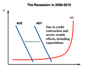
- lower levels of consumer and business confidence.
- lower interest rates (because the demand for borrowed money is low and/or rates have been reduced as a result of government policy).
- levels of saving may rise as some people put off consumption decisions (especially if their job is at risk).
A boom is a period when the general level of economic activity is above average, characterised by the following:
- higher levels of consumption expenditure, particularly on durable goods and luxuries.
- a general feeling of confidence in the economy.
- the profit share of GDP is relatively high (businesses in general are relatively profitable).
- firms have little excess capacity (production bottlenecks exist).
- cyclical unemployment is relatively low.
- participation rates of labour in the workforce are usually at their highest level.
- inflationary pressure is more likely because there is competition in both factor markets (i.e competition for resources) and final markets (i.e. competition for goods and services).
- imports (of both consumer and producer goods) are relatively high.
- the level of borrowing may be high, even if interest rates have risen, due to the level of economic confidence that prevails.
Activity – compare UK, US and Germany and find…
- the rate of economic growth,
- inflation rate
- unemployment rate
in each country over the last 10 years. Prepare a scatterplot in which you plot the rate of economic growth on the x-axis against the inflation rate on the y-axis. Does your graph suggest a relationship?
Do the same thing for rate of growth and unemployment, either on another graph, or by using a second scale on the y-axis. Does this graph suggest a relationship? Suggest why, referring to the ADAS model developed here.
With lower aggregate demand, prices tend to rise at a slower rate during a slowdown in economic activity . Lower rates of price increase reflect lower competition for resources. Producers are less likely to pass on anyincrease in input costs because they find the economy is more competitive – it is harder to make profits in a downturn.
When economic activity improves, the level of aggregate demand begins to rise again (shown by a rightward shift in the AD curve ). Rising demand is translated into rising levels of output and employment.
Business firms readjust to normal capacity.
Inflationary pressure?
What happens if aggregate demand keeps on rising? What would happen if AD keeps moving to the right to some imaginary level AD3? Could output and employment continue to rise? The answer is no, because the ‘speed limit’ of the economy is governed by its capacity – i.e. by the long run aggregate supply curve. As a result, when the economy expands beyond its potential output, the result is not rising production, but rising prices.
Output cannot keep rising, so rises in aggregate demand cause competition for available resources, forcing up prices.
Supply side shocks
Changes in aggregate supply have an impact on business conditions.
A supply shock is shown by an inward shift of the aggregate supply curve The new short run equilibrium occurs at Qd 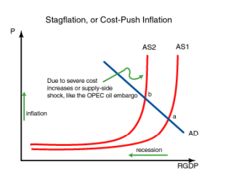 (output has fallen) and P (prices have risen).
At this equilibrium, there is both economic stagnation and inflation at the same time. This is often called stagflation – concurrent levels of high prices with lower economic activity. The resulted from the increase in oil prices that took place in 1973 (when oil prices tripled in less than a year) and again in 1978.
More recently, oil prices increased significantly in 2007, when prices at the petrol pumps rose from 90p per litre to £1.45 per litre at their highest point. But in 2014 they fell sharply after OPEC failed to enforce production quotas from August.
These unexpected increases in oil and petrol prices had the effect of increasing production costs (because a large portion 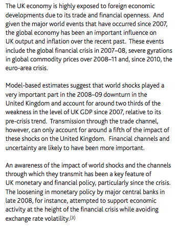 of the cost of most goods and services is the transport costs involved in their production and distribution). Or, in 2014-15 production costs fell sharply – a welcome supply-side boost the British economy.
Rising petrol prices also had an impact on consumers’ real purchasing power, as household transport costs (commuting, for example) rose, and as food prices went up as delivery costs increased.
Other examples of supply shocks that had significant effects on the economy include natural disasters (such as Hurricane Katrina in the US in 2007, or flooding in the west country in the UK in 2013), the threat of disease (the flu virus in 2009) and terrorist attacks such as those on the World Trade Centre in 2001 and the London underground in 2006.
Each of these can have economic effects represented by the using the AD/AS supply shock model. Each of them had an immediate effect on costs and confidence in the economy. Here is part of a Bank of England report detailing the sensitivity of the UK economy to external supply shocks.
Long term growth
Long term average rate of growth for the British economy is about 2%. Using the AD/AS approach curve, we can model growth as a rightward shift of the LRAS. This may result (among other things) from:
- the utilisation of new resources (a discovery of new North Sea oil fields, for example).
- productivity improvements due to changes in working practices, legislation or reduction in Trade Union power.
- improved incentives due to a change in the tax regime (for example, altering in welfare benefits relative to wages at the bottom end, or increasing tax breaks for entrepreneurs).

0 Comments